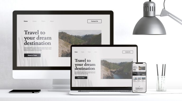
A successful WordPress website is more than just its content or technical performance. Its visual identity – driven by color and typography – shapes first impressions, communicates brand value, and plays a critical role in usability and engagement.
Why Color Matters in UI/UX
- Brand Recognition: A thoughtfully chosen color palette instantly communicates your brand’s personality. Consistent use of brand colors across the website builds familiarity and trust.
- Emotional Response: Colors can evoke strong emotions. For example, blues often suggest trust and stability, while vibrant hues like orange or green can energize or inspire action.
- User Guidance: Contrasting accent colors help highlight CTAs, menus, or important features, directing user attention where it matters most.
- Accessibility: Strong color contrast is non-negotiable for readability, especially for visually impaired users. High-contrast text (light-on-dark or dark-on-light) ensures your content is universally accessible.
Tips for Using Color in WordPress:
- Choose a primary color and 2–3 accent shades that reflect your brand and appeal to your audience.
- Use neutral backgrounds to keep the interface uncluttered and emphasize key elements.
- Test your palette for accessibility to ensure all users can read and interact with your content.
The Importance of Typography in WordPress UX
- Readability: Clean, legible fonts improve comprehension and reduce user fatigue.
- Visual Hierarchy: Using clear size and type contrasts for headlines, subheadings, and body text naturally draws the reader’s eye through your content.
- Brand Personality: Just like color, the right font communicates your site’s tone – whether it’s modern, playful, formal, or approachable.
- Consistency: Limiting font choices to two or three families ensures a cohesive and professional look throughout your site.
Tips for WordPress Typography:
- Select Google Fonts or trusted web fonts that are easy to read on all devices.
- Use bold or large headings to create clear focal points and guide users through each section.
- Maintain spacing (line height and padding) for easy skimming on mobile and desktop.
- Pay attention to contrast: Make sure your text color stands out against the background for maximum readability.
Current Trends (2025 Highlights)
- Minimalism: Simple palettes and uncluttered fonts remain popular for a clean, professional aesthetic.
- Microinteractions with Fonts: Small animations or hover-effects on headings or buttons make the design feel interactive and modern.
- Dark Mode Support: Many WordPress themes now offer seamless toggling between light and dark backgrounds, requiring thoughtful color and font contrast for both modes.
- Storytelling Through Typography: Large, expressive headlines and playful type pairings help brands tell their story visually as well as verbally.
Conclusion
Color and typography are not just decorative – they’re foundational to a WordPress site’s success. By using a careful combination of accessible color contrast and purpose-driven fonts, you create a delightful, memorable, and user-centered experience that will keep visitors engaged and coming back for more.
Stay Ahead with the Latest Tech & Business Insights!
Get trending news, expert tips, and industry updates—delivered straight to your inbox.
"*" indicates required fields


